In december I worked on a project that required me to work on spatial data. This led me to learn about how R deals with this kind of data and to look around for ways to make my “spatial data experience” less painful. I discovered that R is, as always, full of options.
I’m used to dplyr for exploring data and manipulating it, however when it comes to spatial data, I think that gstat, raster and rasterVis are just some of the useful packages that will make your life a lot easier.

For instance, suppose you would like to analyse, among the other variables, the net heat flux ($\frac{w}{m^2}$) data (from here on referred as “qnet”). The data can be found on the website of the WHOI OAFlux Project1, which has a lot of available satellite observations dating as back as 1985. These observations come in nice netcdf files and can be monthly or daily, as far as I know.
When doing your analysis, it will almost surely happen that qnet is not the only variable you are considering, and in that case, if you have gathered spatial data from many different sources, not all of it may have the same resolution! This can be a bit of a problem since if you would like to use almost any model that R offers, you need the same number of features and less NAs as possible!

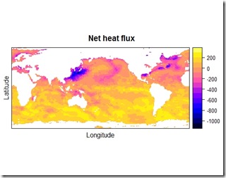
Qnet has a resolution (longitude x latitude) of 180 x 360 pixels. This means that for each year (read: file) you will find 365 grids of 64800 observations each. Or if you prefer, each netcdf file will offer 23652000 observations of the qnet variable. In reality, a good sized part of these pixels, as you can see from the picture above, represent land, therefore they are just NAs to be ignored.
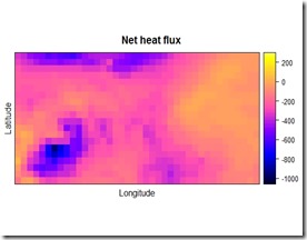
If you are interested in a particular region, you can use the raster::crop function on the raster object in order to select the area you need. For this example, I wanted to focus my attention on a 40x20 pixel region in the north of the Atlantic Ocean. This is the plot of the selected region:

Now suppose that all your other datapoints are in a different resolution, say 161x81 pixels. The gstat package is the solution to the problem! By choosing the appropriate algorithm you can easily resize any spatial grid you like. I chose to use the inverse distance weighting interpolation since I wanted to obtain a smooth surface, but keep in mind that in the docs there are a lot of other methods for interpolating a surface and, depending on your particular problem, another method may be a better fit. Inverse distance weighting is a technique that estimates the unknown points by taking an average of the points near by. As the name suggests, the points closer to the ones to be estimated have greater impact on the estimate. I think this method is suited to this task since by just changing the resolution I do not expect (and would like to avoid) significant changes in the distribution of qnet.
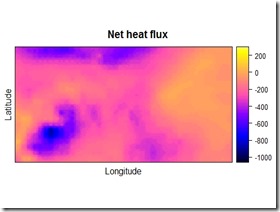
The result of the procedure is showed below:

As a comparison, you can check the pictures before and after the change in resolution by putting them side to side. Just be sure to set the colorbar at the same level for both of the pictures, otherwise it would be pretty hard to tell what has changed and what not. I think you can tell that the picture on the right is the one with the higher resolution.


By using the rasterVis::levelplot function, you can check a perhaps more insightful plot with the marginal distributions of the qnet variable. As you can see, the overall distribution and the marginals of the variable have not been altered significantly, however now we have more datapoints and we can match the qnet data to the other data for the analysis. I would suggest playing around with the parameters in the gstat::idw function, depending on the resolution you would like to achieve, they can make some difference in the outcome. Below you can find the code I used for this example. This is not exactly the code I used in the project but the basic concept is the same.
Then you might have the weird idea to make a short video of the observations over the years 2008 and 2009 to have a look at how the qnet evolved as times passed by. Nothing easier in R, just use a for loop for saving each picture and you’re almost done:
Then use your video editor of choice and you’re done! I have to admit though, making the video was the first thing I thought when I made the first plot
Thank you for reading this post. Leave a comment if you have any suggestion and if you have found it useful please share it.
1 Global ocean heat flux and evaporation products were provided by the WHOI OAFlux project (http://oaflux.whoi.edu) funded by the NOAA Climate Observations and Monitoring (COM) program.
Hi, this has been very helpful, however I run into a error when I run gridded(data_). I get:
ReplyDeletesuggested tolerance minimum: 0.301308
Error in points2grid(points, tolerance, round) :
dimension 2 : coordinate intervals are not constant
This makes sense because I have latitudes that go along the entire east coast of the US. Is there a way to continue through your steps if the grid is not regular (which I imagine is a common issue for people that have data over a large area)? Also the size of the grid I need to change the current grid to is also irregular. Any help or advice is appreciated.
Thanks for sharing this super helpful guide. I really appreciate your effort.
ReplyDeleteLearn How to Resize an Image in Pixlr
Thank you very useful
ReplyDeleteThis article shares really good content. Very nice to read the article. Keep updating.
ReplyDeleteImmigration Lawyer Near Me Virginia
Personal Injury Lawyers Near Me Virginia
Bankruptcy Attorney Near Me Virginia